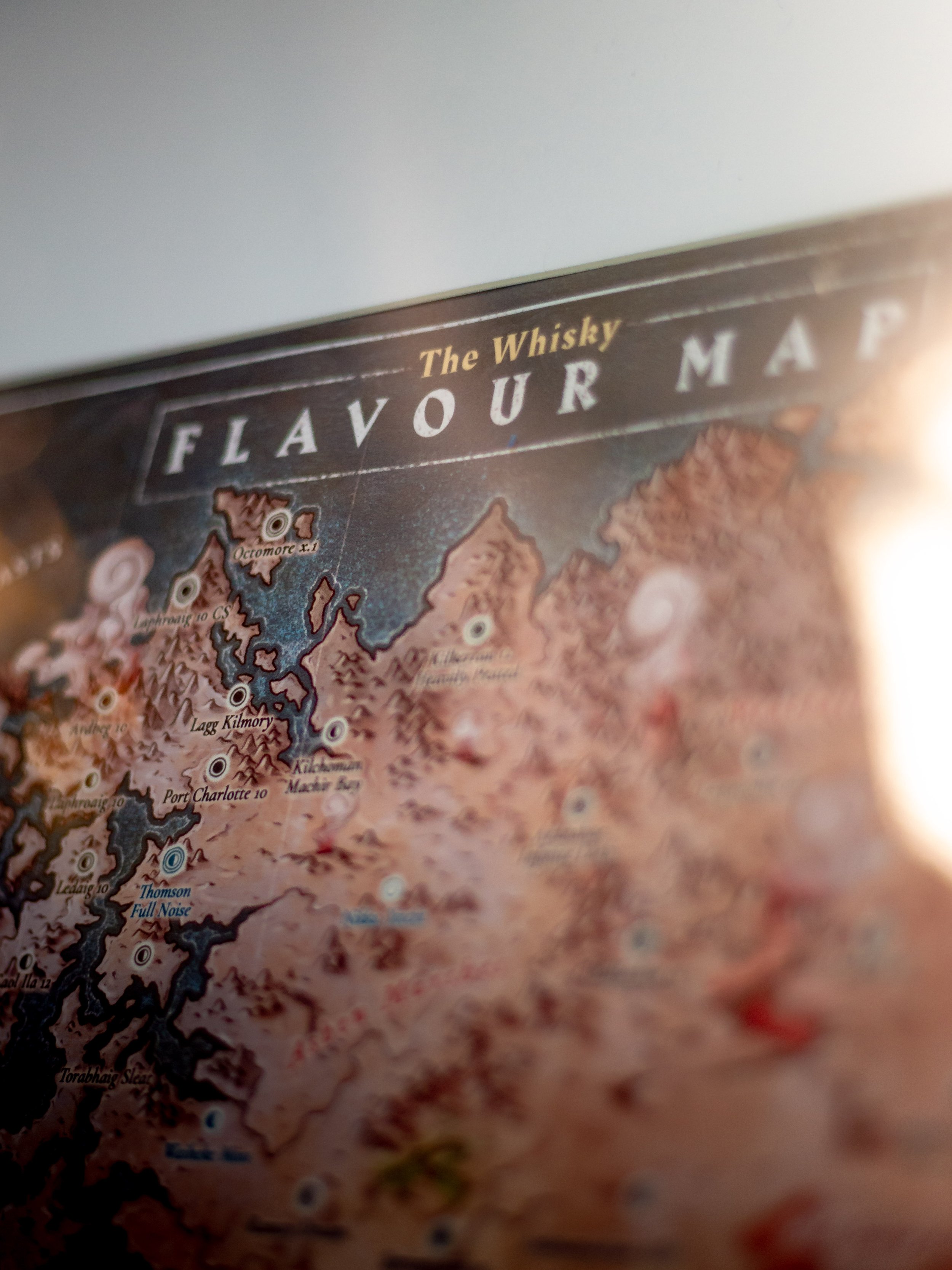


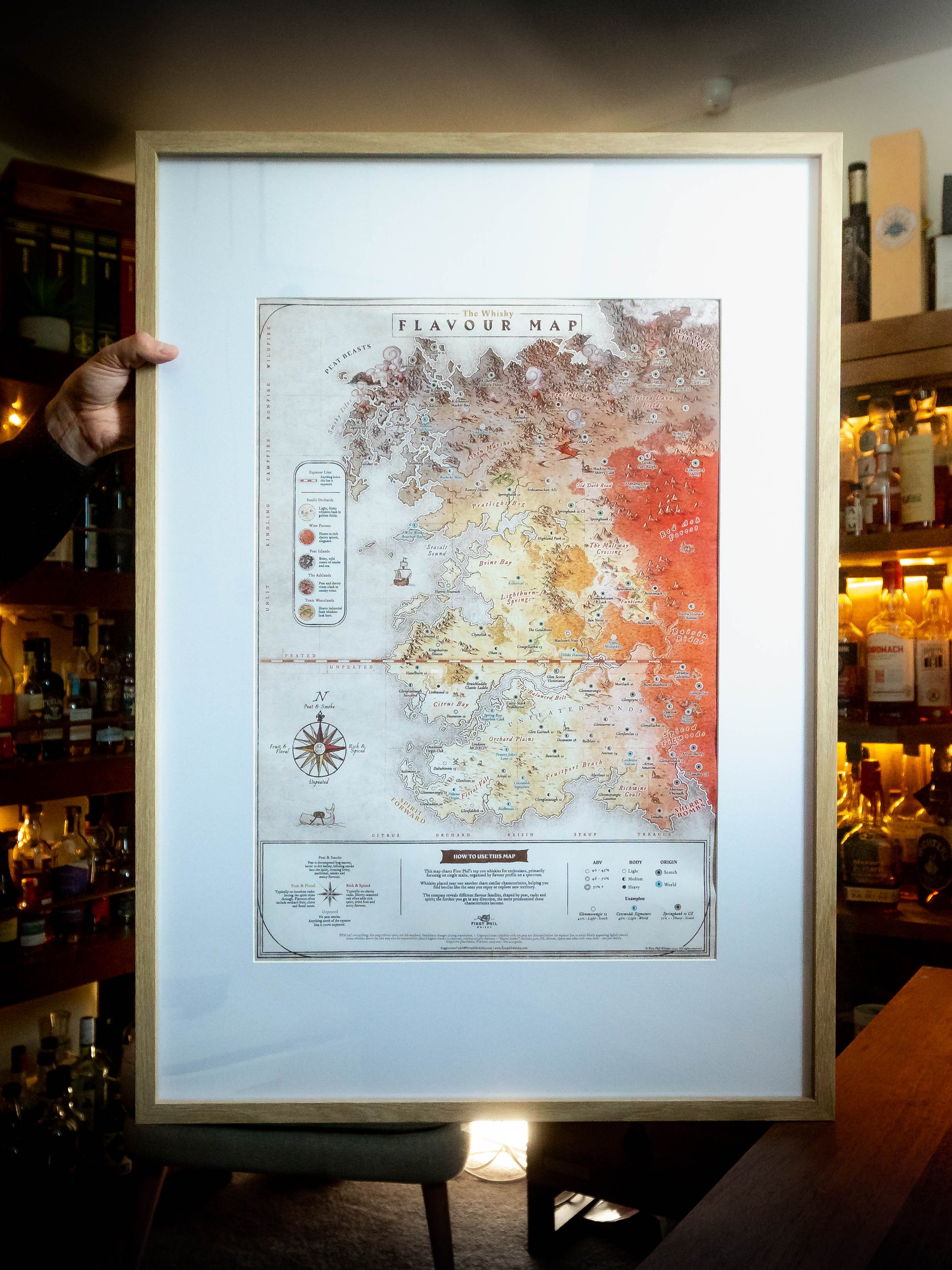
The Whisky Flavour Map


Whisky region maps look nice on a wall but they don't tell you much about what's in the bottle anymore. Speyside distilleries make peated whisky. Islay makes some delicate fruity stuff. I got sick of the exceptions, so I made a map based on flavour instead.
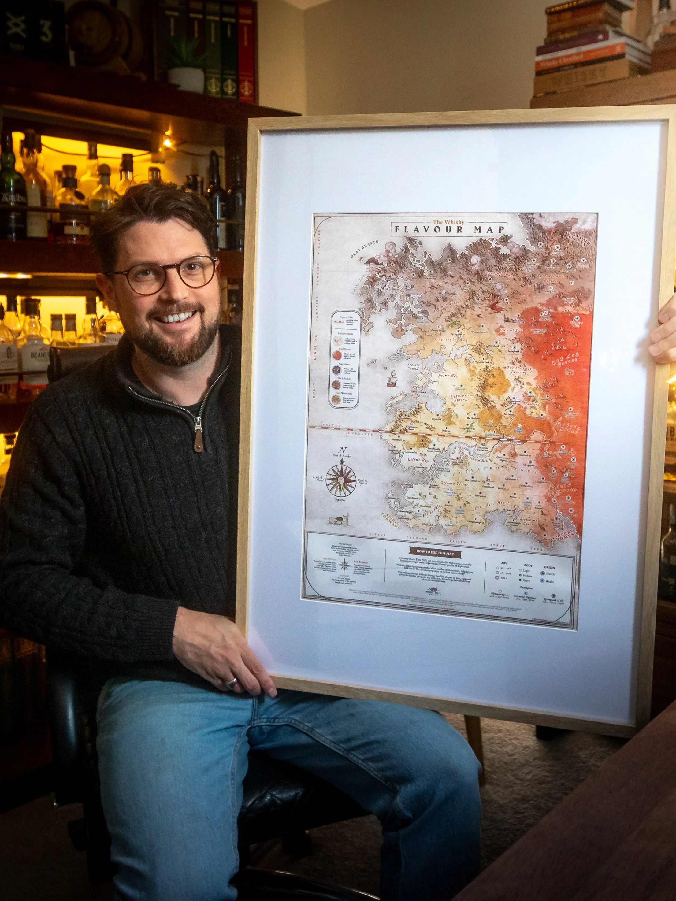
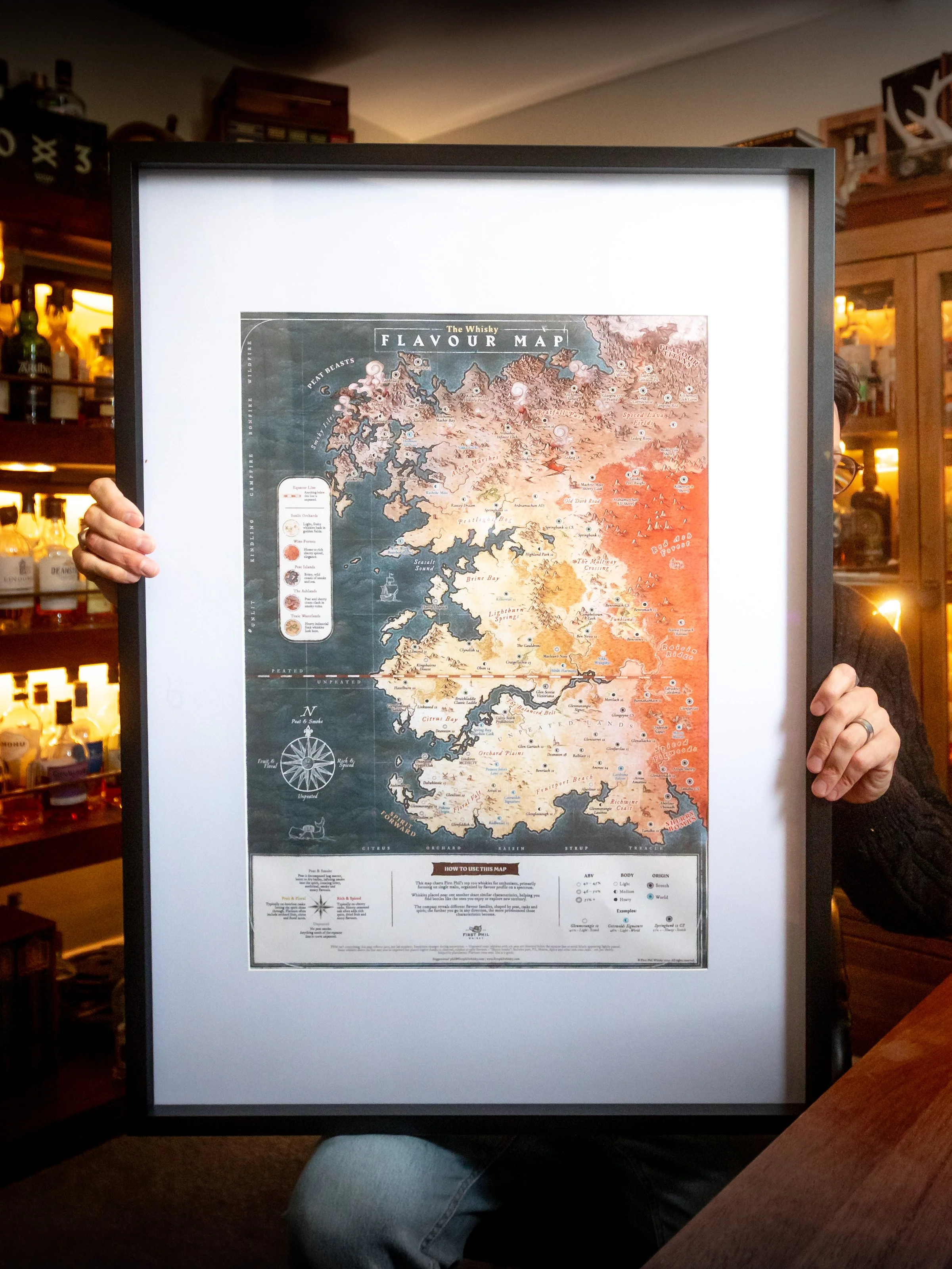
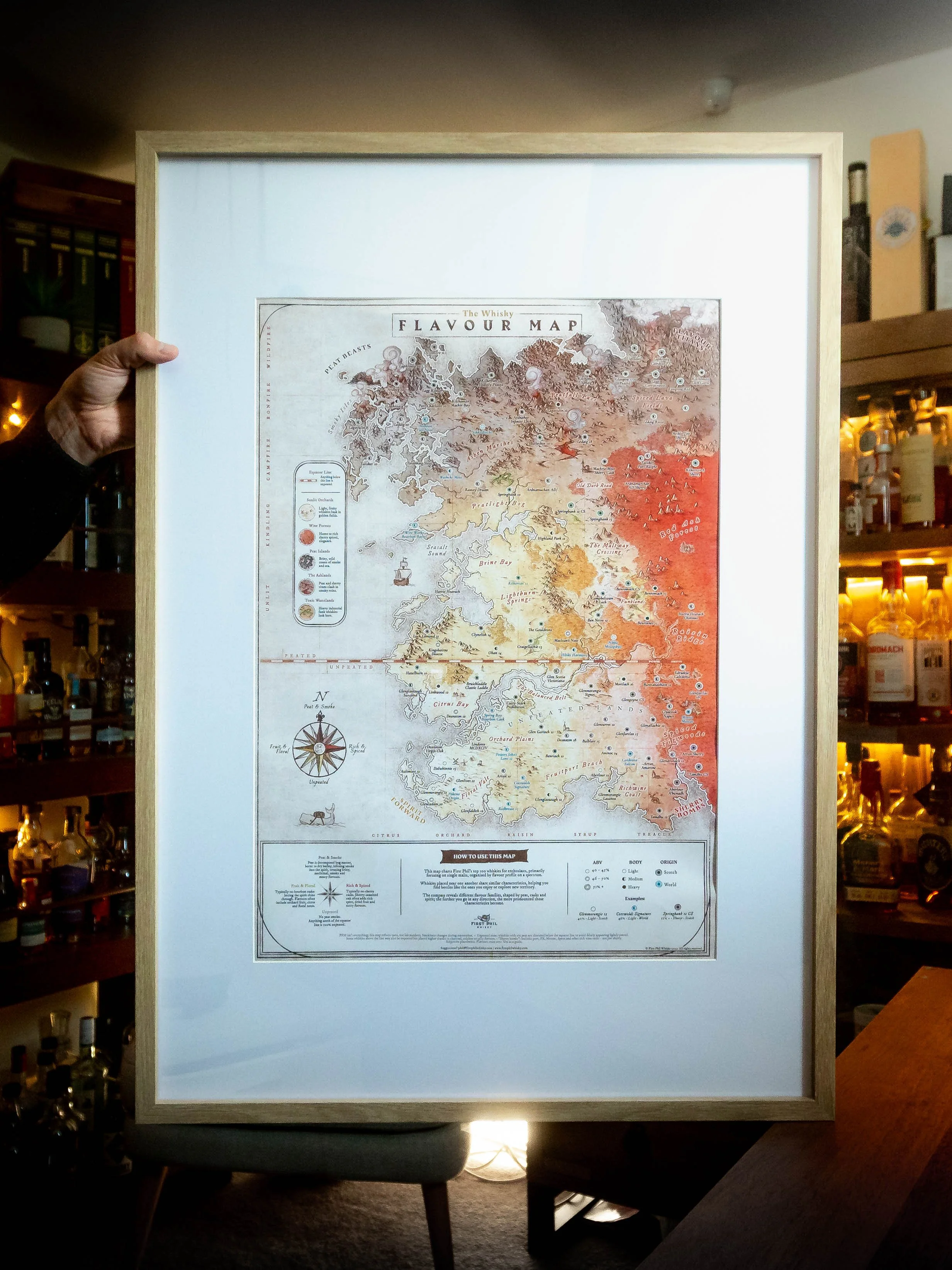
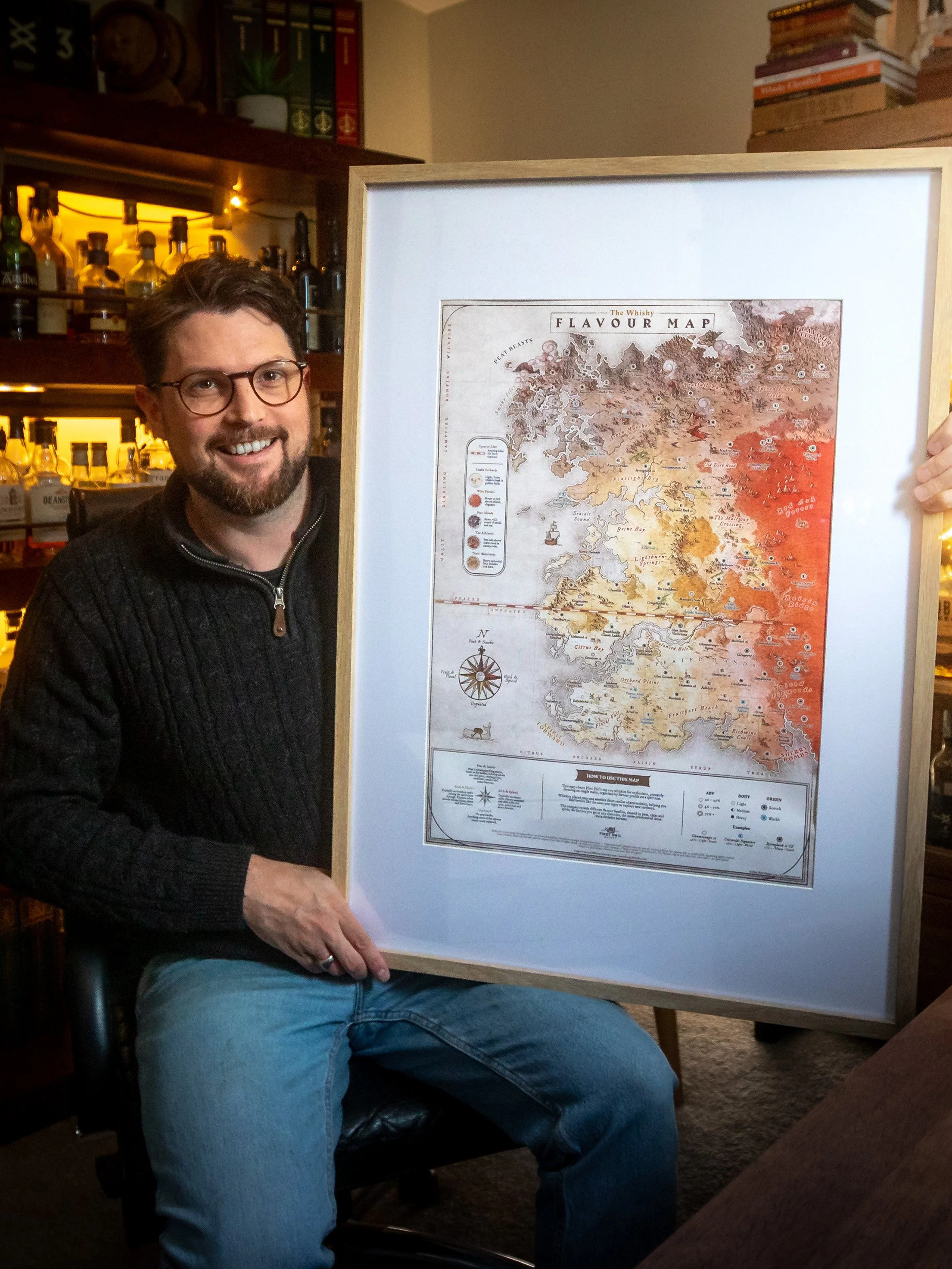
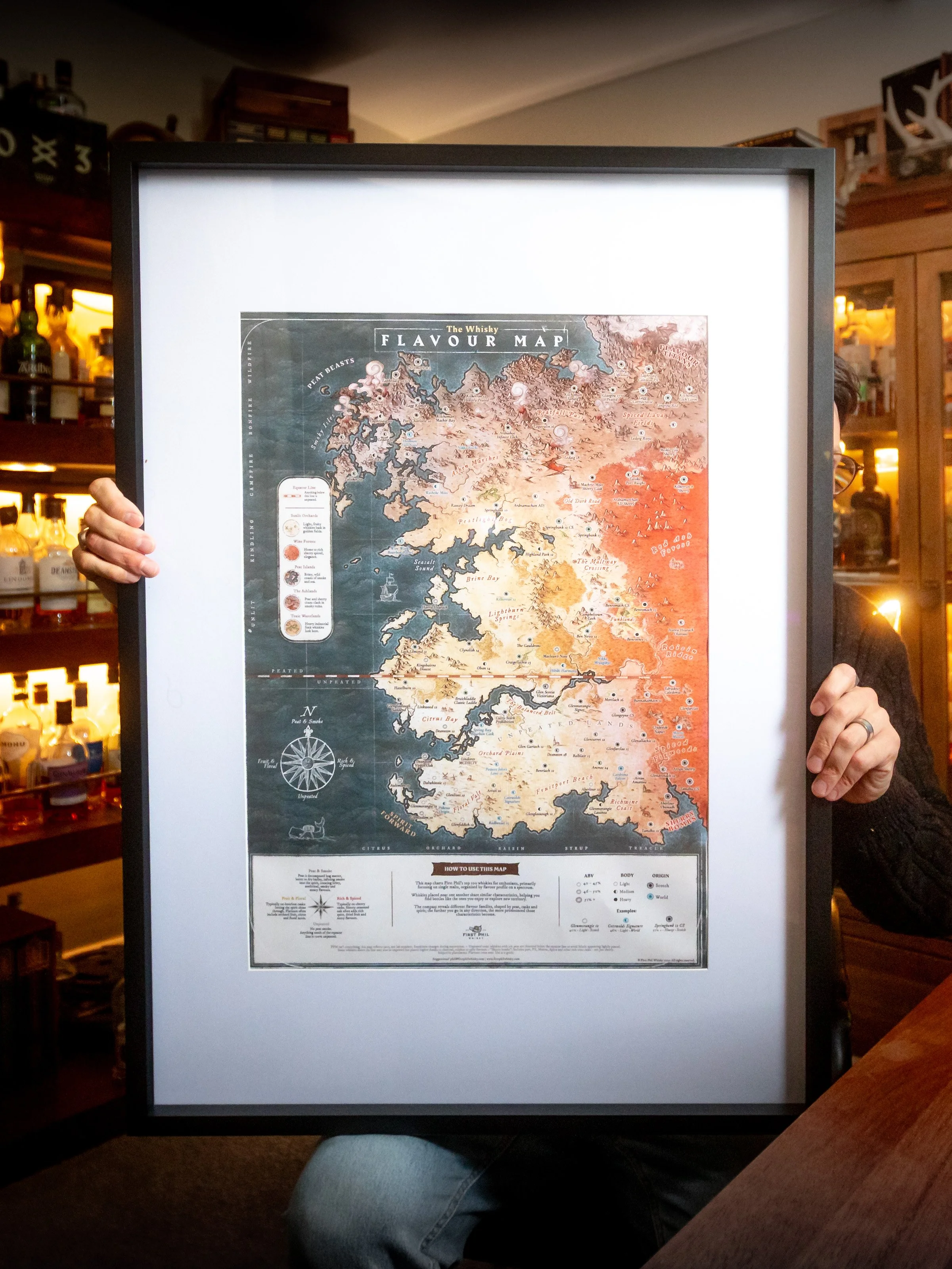
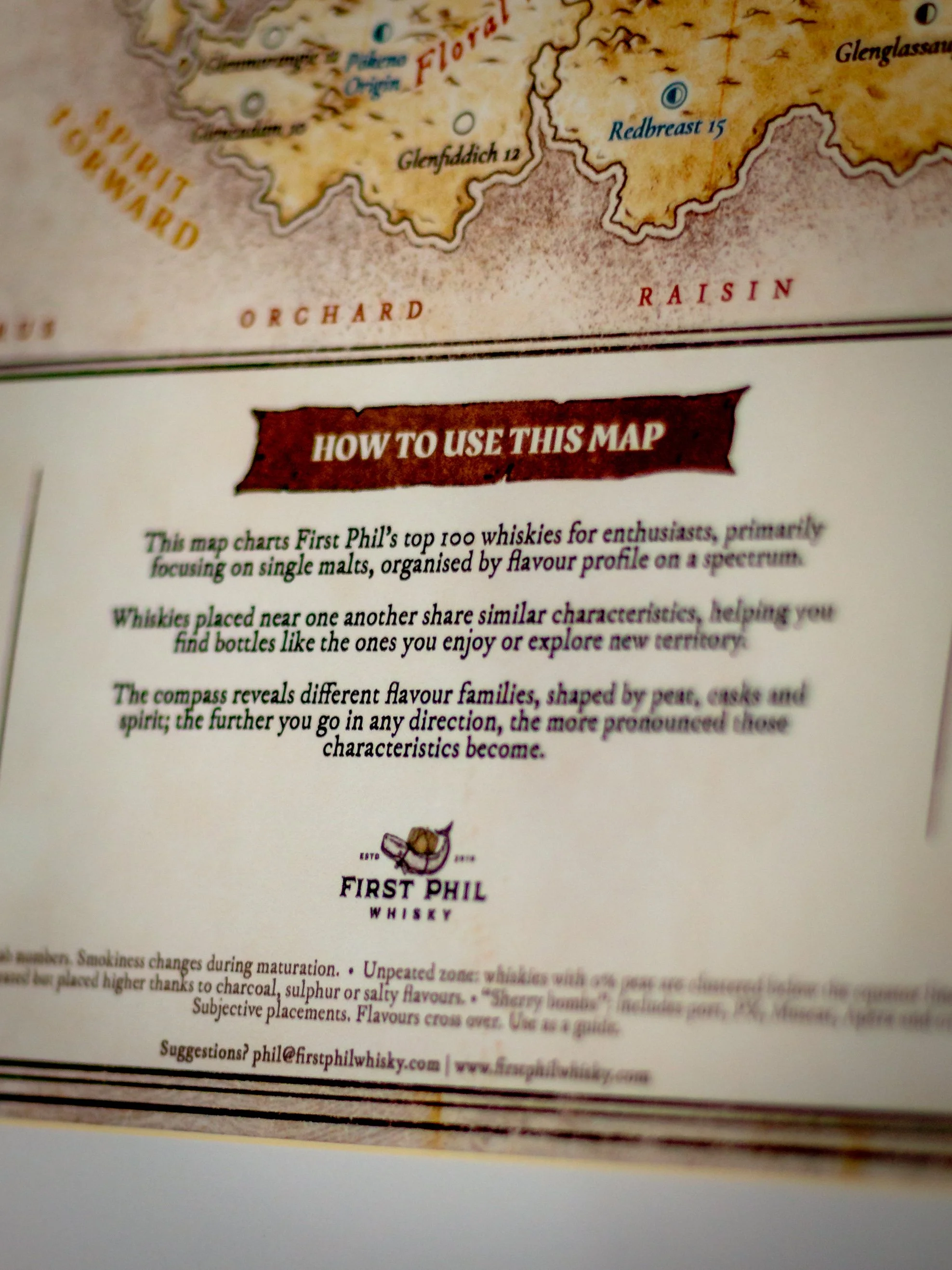
This poster (handrawn by a paid pro fantasy map illustrator, no AI at all) has around 100 whiskies (from my 2026 Top 100 for Whisky Enthusiasts) laid out by how they actually taste, drawn up like an explorer's map from the 1600s. Flavour matrix spectrum charts already exist, I just didn't want to hang any of them on my wall.
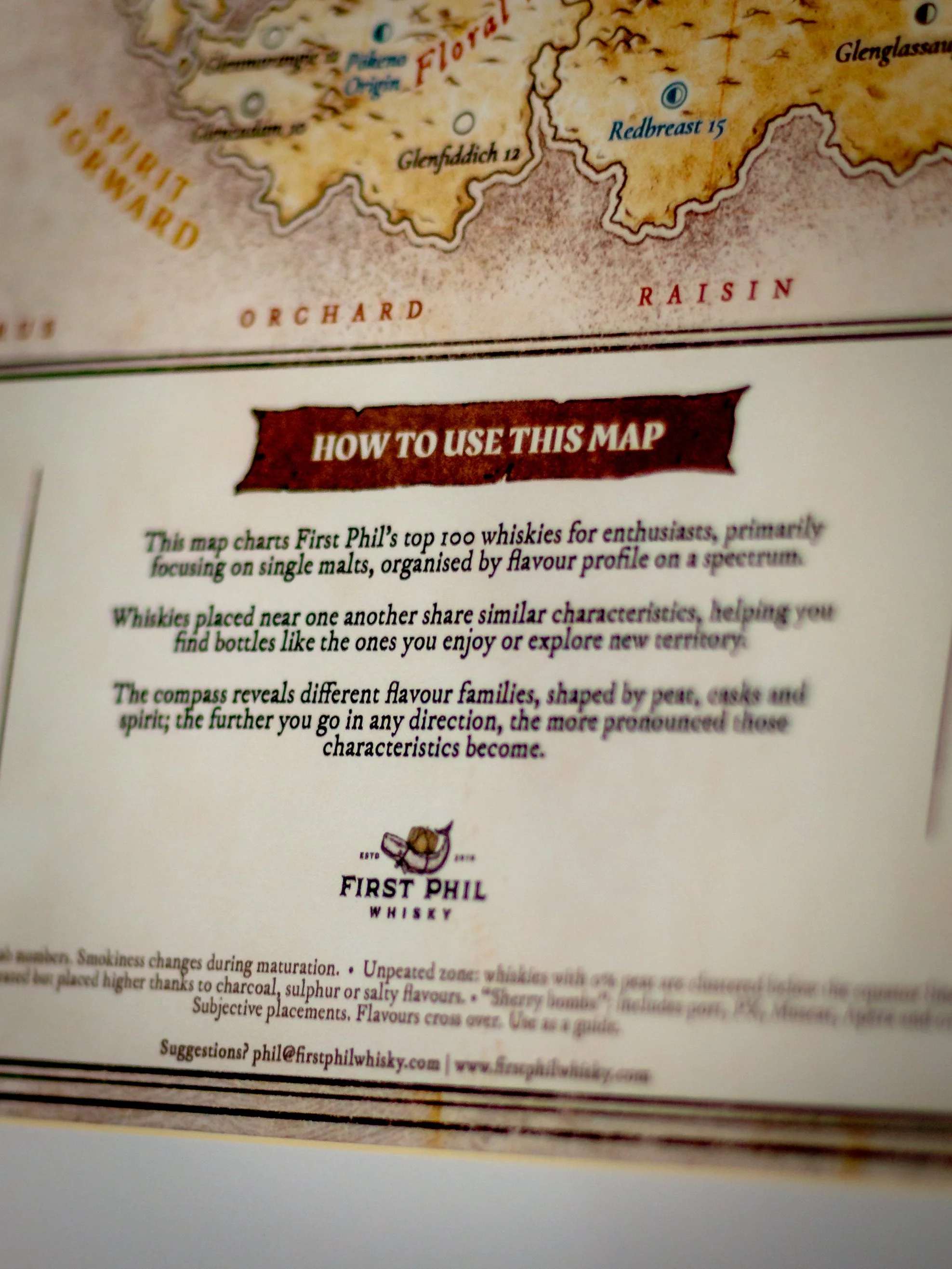
How to read it
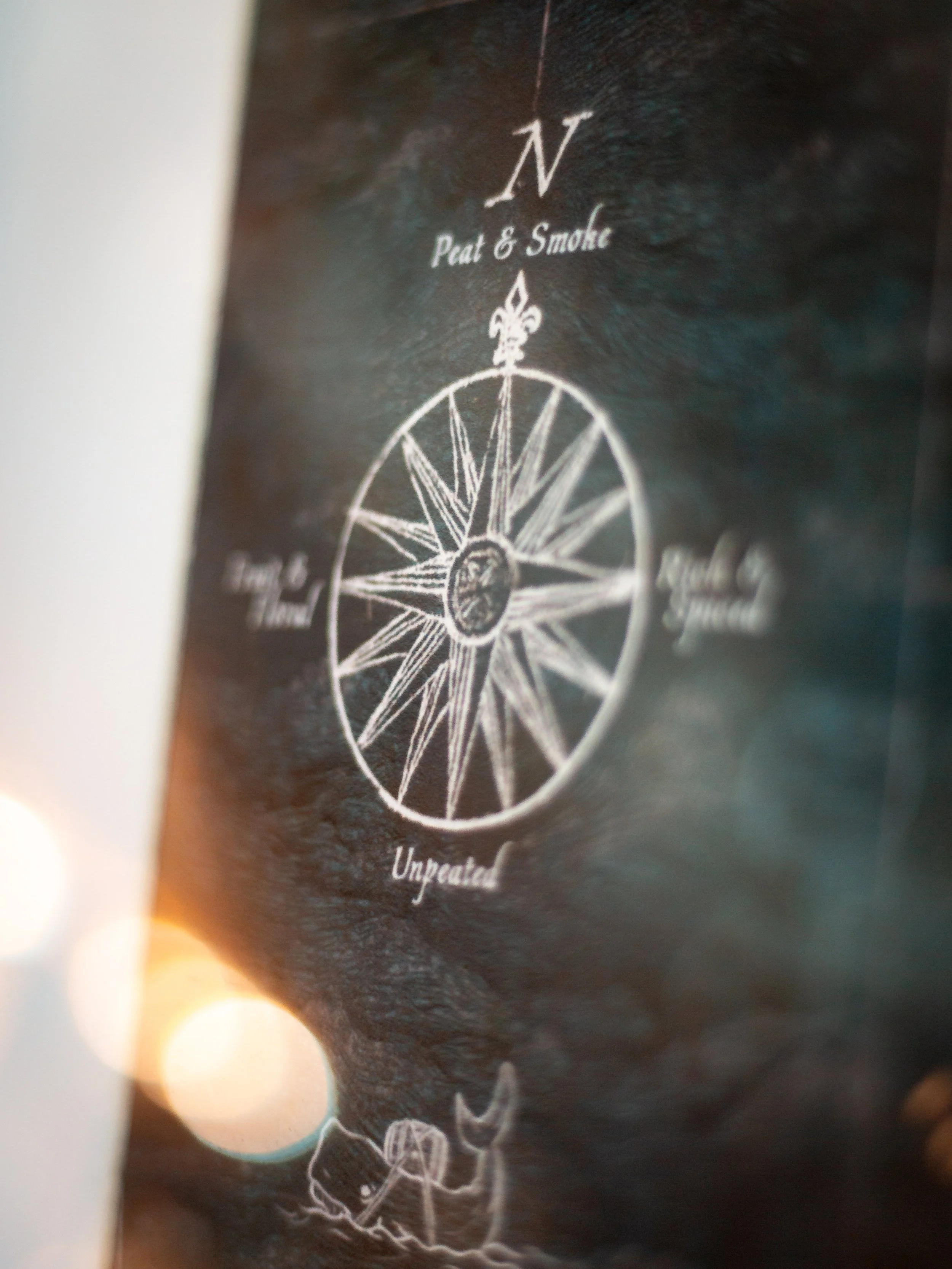
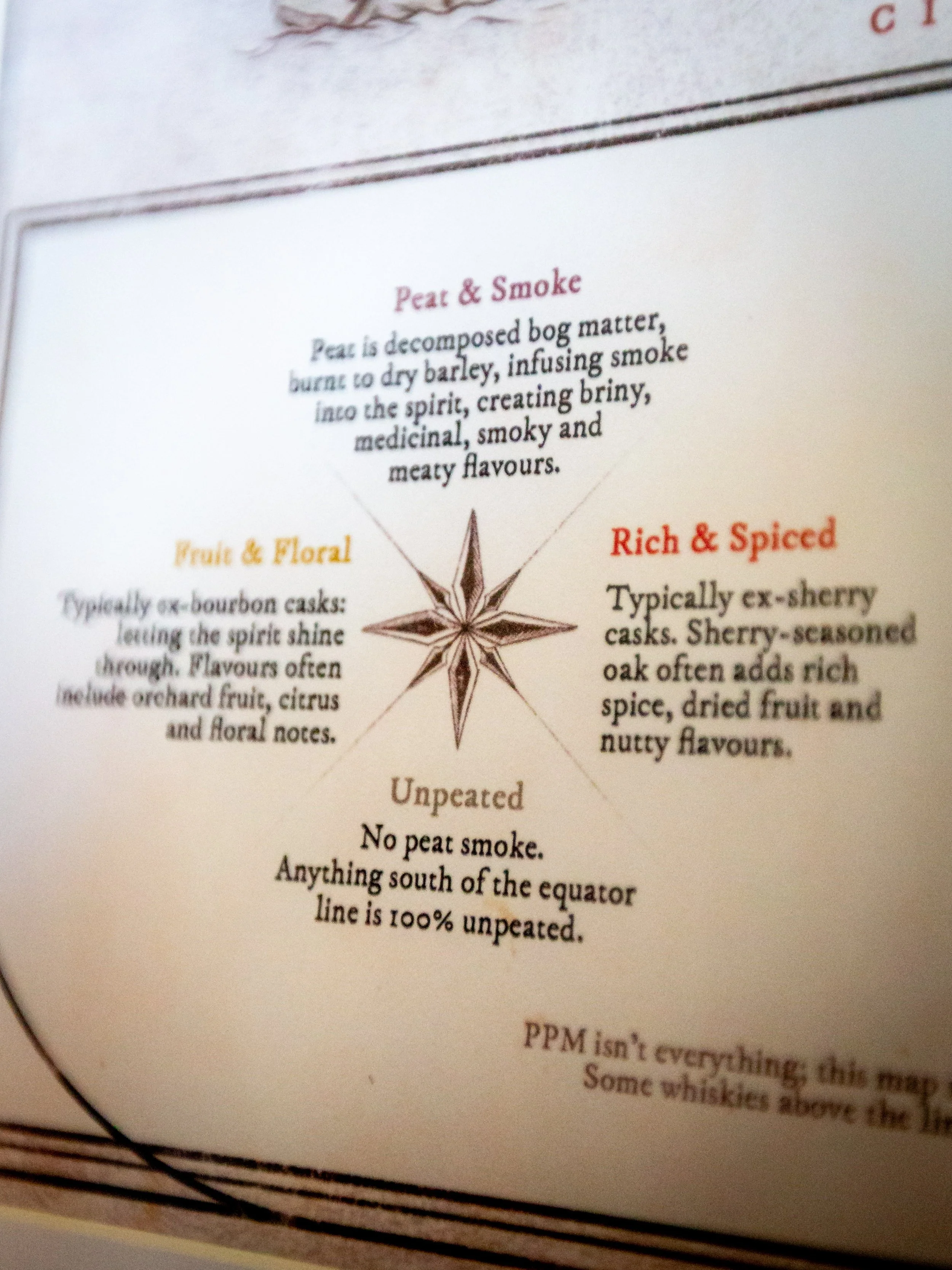
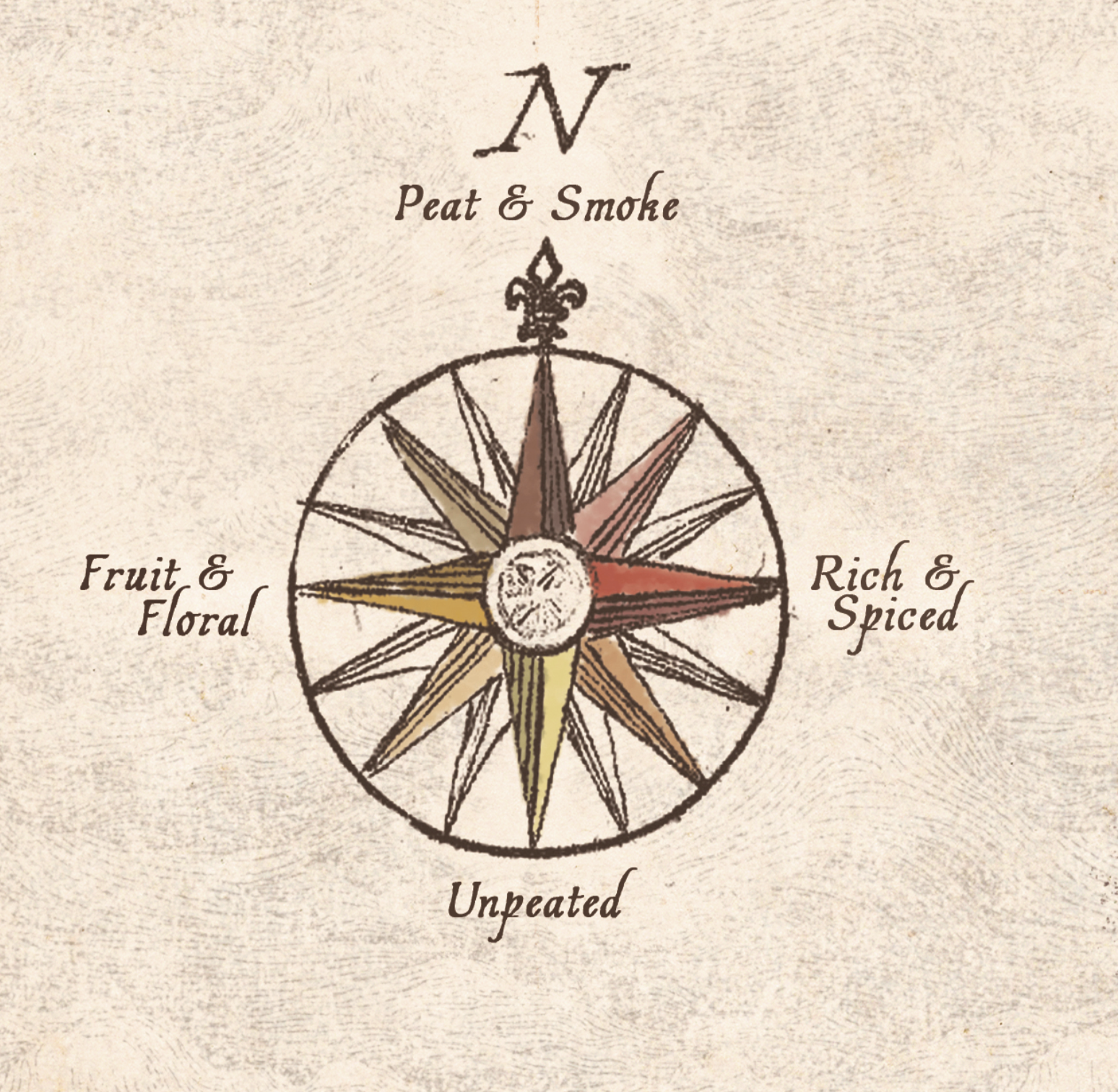
Four directions. North is peat and smoke. South is unpeated. West is fruit and floral, mostly ex-bourbon casks, so orchard fruit, citrus, vanilla and floral notes. East is rich and spiced, mostly ex-sherry casks, so dried fruit, Christmas cake, nuts and warming spice. The further out you go in any direction, the more of that character you get.
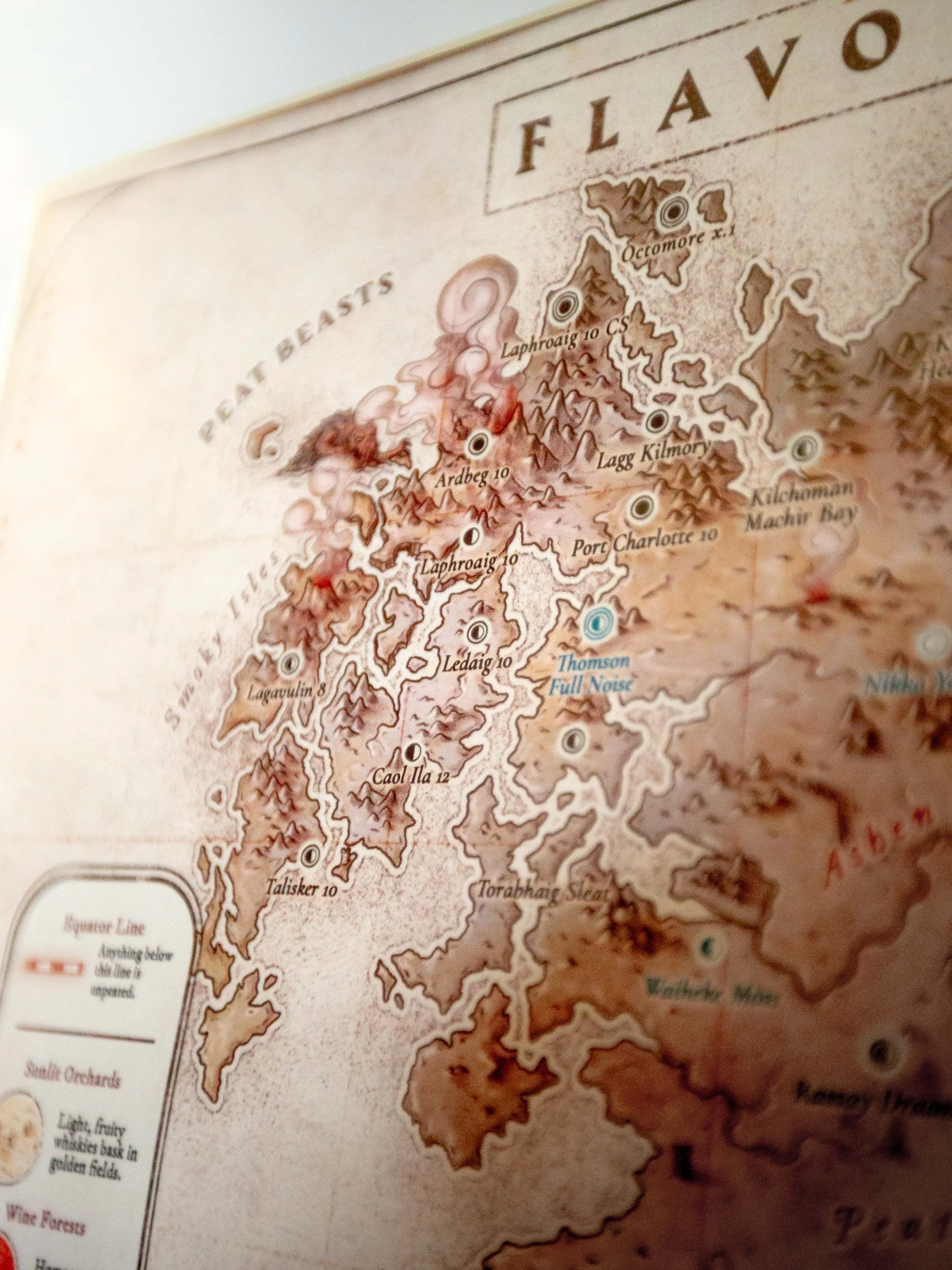
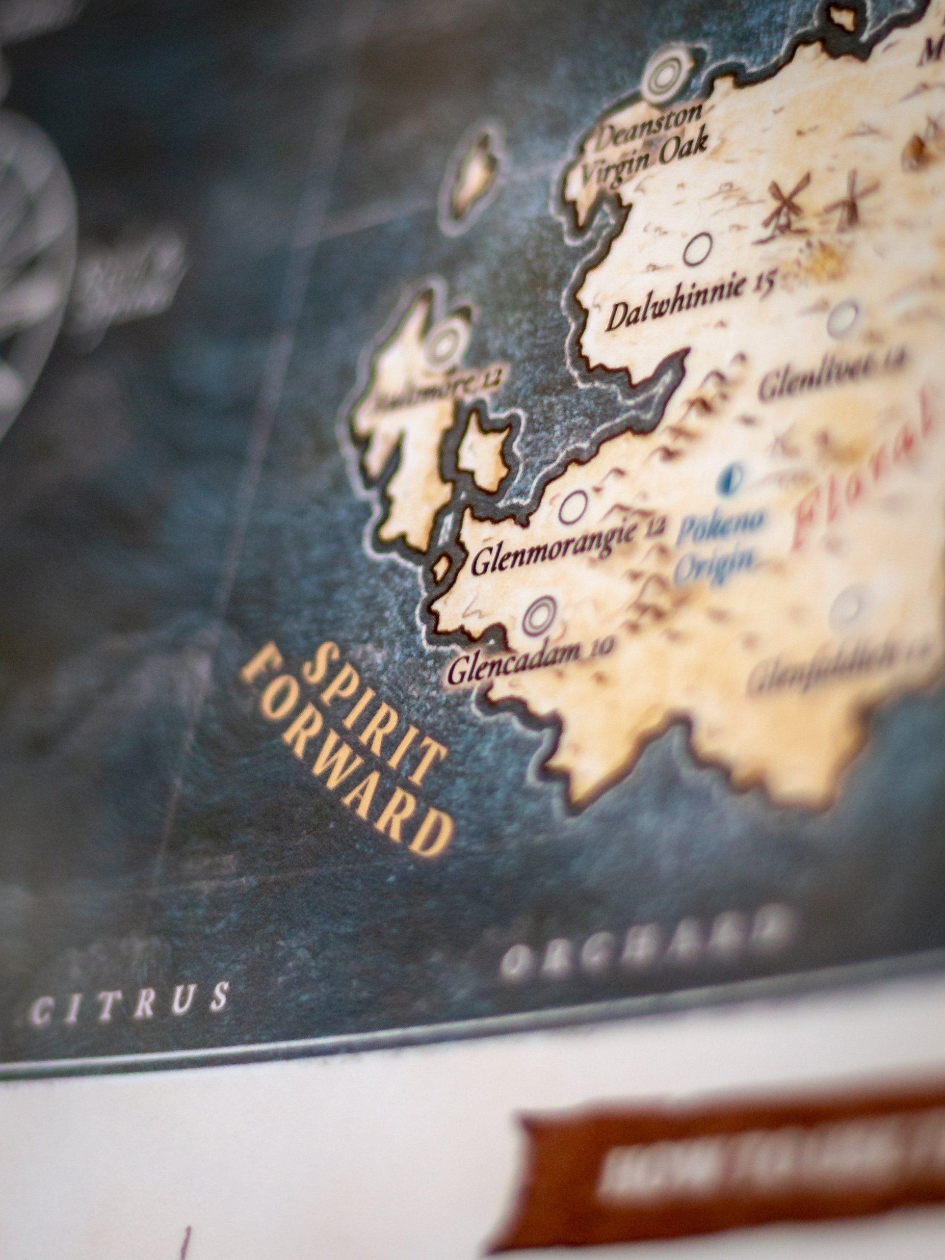
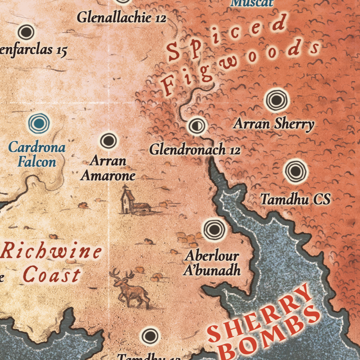
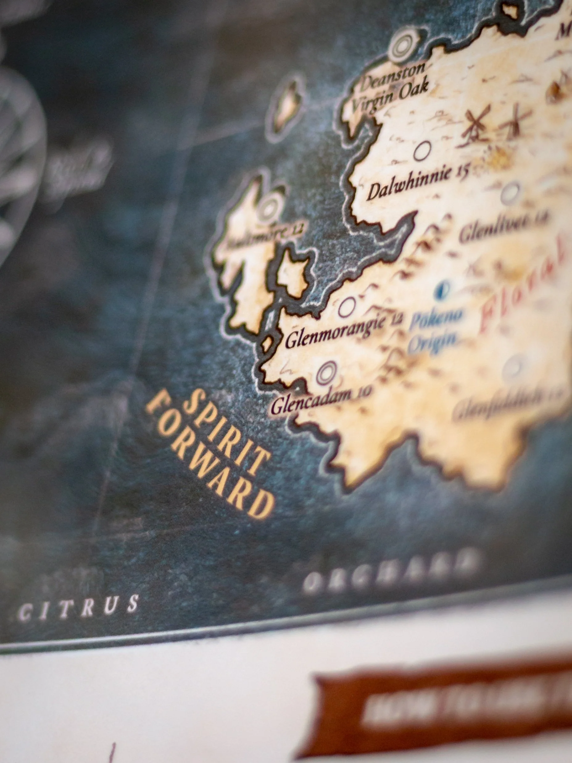
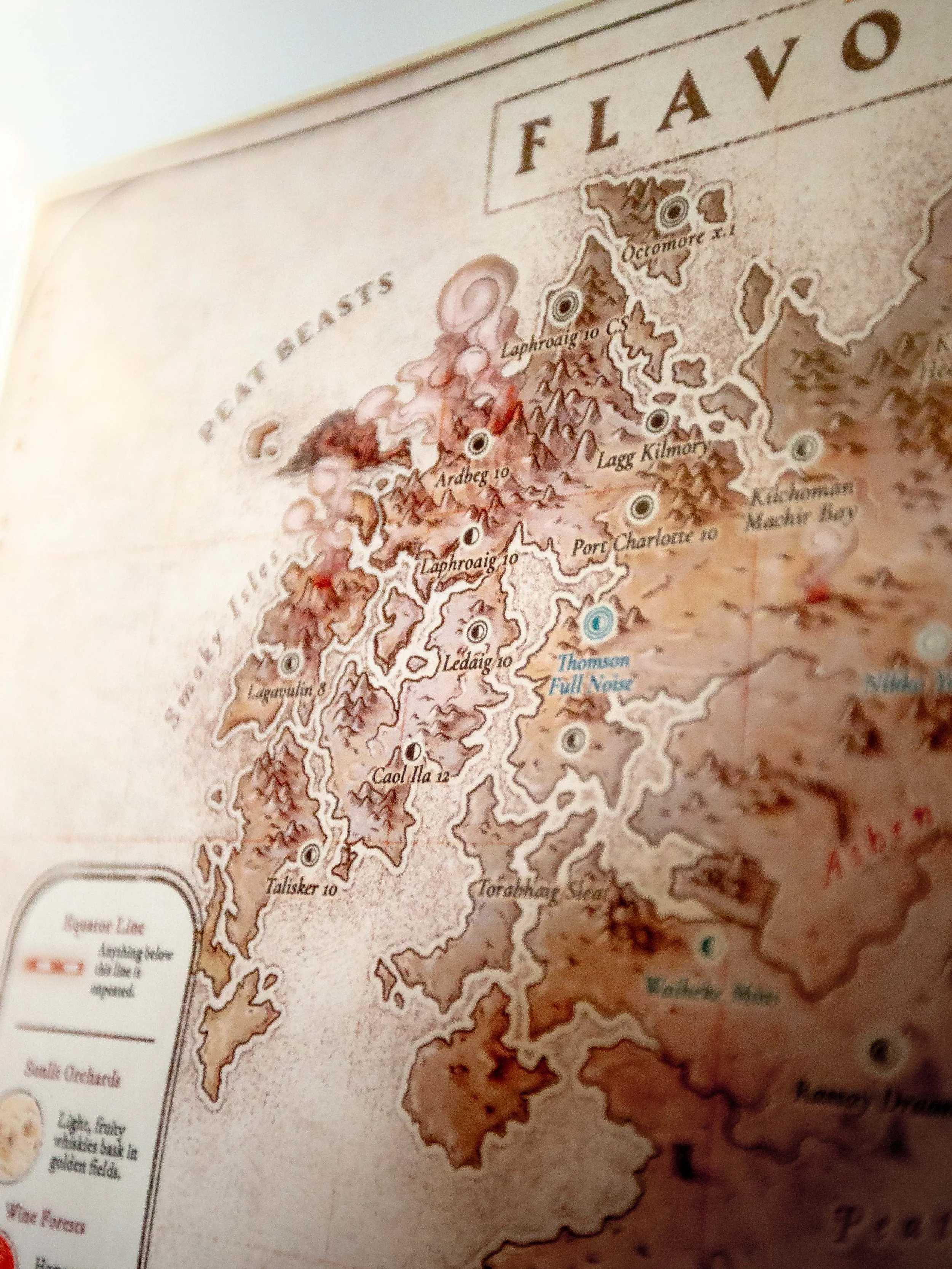
The corners are the fun bit. Northwest is bourbon cask plus heavy peat, the coastal smoke bombs like Laphroaig 10, Ardbeg 10 and Lagavulin 8. Northeast is sherry cask plus peat, the big hitters like Ardbeg Uigeadail, Laphroaig PX and Kilchoman Loch Gorm. Southeast is unpeated sherry, the Christmas cake end of things, Tamdhu 12, GlenAllachie 12, Aberlour A'bunadh. Southwest is unpeated bourbon cask, light and summery, Dalwhinnie 15, Glenmorangie 12, Glencadam 10.
Everything else sits somewhere in between, lightly peated whiskies and the ones with a more balanced cask influence, plus the funky Campbeltown stuff (those get their own landscape features so you can spot them). Each whisky is a dot. The size of the dot is the body weight and the rings around it are the ABV. World whiskies from Australia, New Zealand, Ireland and England are marked in blue. There's a legend on the map explaining all of it.
What you'd use it for
Mostly finding your next bottle. If you've got one you love, look at what's sitting next to it on the map and that's your next buy. Or head the other way if you're after something different. It's also handy for working out what peat or a sherry cask actually does to a whisky, or deciding what you're in the mood for before you open anything. And it gets people talking when it's on the wall of a home bar.
The artwork
Drawn by hand by a professional map illustrator, no AI anywhere in it. The landscape follows the flavour, so there's peat bogs and misty islands up north, barley fields and orchards down south, red autumn forests in sherry country and volcanic peaks where peat meets sherry. It looks like something out of Tolkien, or a chart Francis Drake would've had on the boat.
Editions, sizes and paper
Two versions. The Light Edition is parchment coloured with warmer tones and more contrast, good for living rooms and offices. The Dark Edition is moodier and deeper, better in a whisky room or home bar.
Comes in A1 (59.4 x 84.1cm) and A2 (42 x 59.4cm), printed on 200gsm semi-gloss FSC-certified paper that won't fade. Printed on demand and shipped from a printer near you, usually 7 to 10 business days. Frame not included.
Makes a good present for a whisky person too, and it lasts a lot longer than a bottle.
It’s shipped from 32 countries, so whether you’re from Europe, the States, Canada, Australia, New Zealand, Singapore, the UK, you will be able to get it within 7ish days. My shop uses printers from around the world, so you'll be able to get it within the week. So it's not actually shipped from New Zealand (unless you live in New Zealand).
About me
I'm Phil Gow. I run First Phil Whisky, one of the biggest whisky channels on YouTube, from Christchurch, New Zealand. I make videos that help people get into whisky.
© 2025 Phillip Gow / First Phil Whisky. All rights reserved.
The "Whisky Flavour Map" design, including visual layout, flavour regions, names, structure, and world-building elements, is intellectual property protected under international copyright law. Unauthorized duplication—physical or digital—is strictly prohibited.
What Real Drinkers Say